
Overview
People interested in joining Verizon are faced with a broad set of decisions - which device do I want? What plan is right for my family? How I do get the best value? Verizon’s existing shopping user journeys require these separate decisions to be made in a sequence of discrete steps before checking out. This project proposes an alternative recommendation driven path to checkout.
Existing customer journey
The existing new customer shopping journey requires a minimum of 6 steps to reach cart and see the final price of the device and plan. Multiple competing promotions are offered on the PDP and it is not always clear which is the best value, adding to overall cognitive load.
Decision points when shopping for your first phone on Verizon: 1. Choose a phone, 2. Pick a color, 3. Pick a storage capacity, 4. Choose a promotion, 5. Review accessory upsell, 6. Pick a plan, 7. Review device protection upsell.
New customers are first able to select a promotion on their desired phone’s product detail page. At any time, there may be multiple competing offers for a single phone. Because Verizon’s promotions are tied to a customer’s plan selection, an eligible plan must be selected later in the flow to receive the maximum promotional value.
Identifying the Problem space
Through a review of the existing flows and previously conducted qualitative user studies, we identified key areas for improvement:
Too many decision points
New customers joining Verizon must select and configure a phone, a promotion, a plan and review device insurance options before arriving at a cart showing their estimated pricing. This long journey with so many decision points gives potential customers many opportunities to drop out rather than convert.
High Cognitive Load
What phone do I want? Which plan is right for my family? How do I know I’m getting the best value? These are just some of many questions a new customer may have to answer while shopping with Verizon for the first time.
Lack of Clarity in Messaging and Pricing
New phone sales are driven by promotions, but with many different phones, plans and promotions on offer, it can be difficult for the customer understand what is relevant to their needs, and what the final price is.
Approach
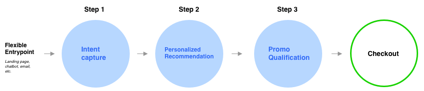
How might we simplify this complex flow for new customers? A recommendation driven flow reduces the number of decision points by filling in the blanks - showing customers what their completed cart could look like without needing to complete every individual step. In order to generate a valid recommendation we would need to gather information up front in a brief questionnaire.
Stakeholder workshop
In order to understand the capabilities of the recommendation system, as well as the necessary inputs from the customer, we held a series of stakeholder workshops. It was determined that we could offer phone and plan recommendations with a personalized value proposition, making it easier for customers to understand promotional value and pricing. Collaboration with Sales subject matter experts gave clarification around the inputs needed to generate the recommendations, as well as the promotions on offer.
Experience positioning and entrypoint
A recommendation based shopping experience, while helpful to some, cannot replace the traditional browsing and shopping flows entirely. We positioned the entrypoints to this standalone experience on marketing landing pages where new customers are likely to arrive via web search results. The messaging “Shop Recommendations,” frames the experience as a way to simplify the complex task of choosing a phone and plan.
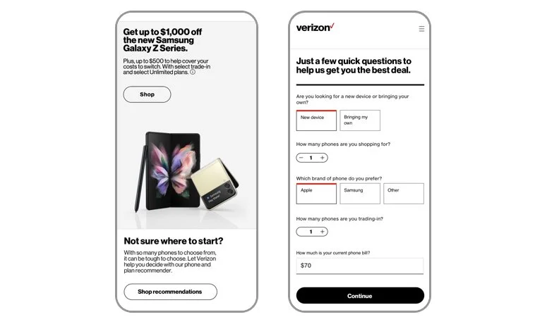
Entrypoint left, and new customer questionnaire, right,
Recommendation view
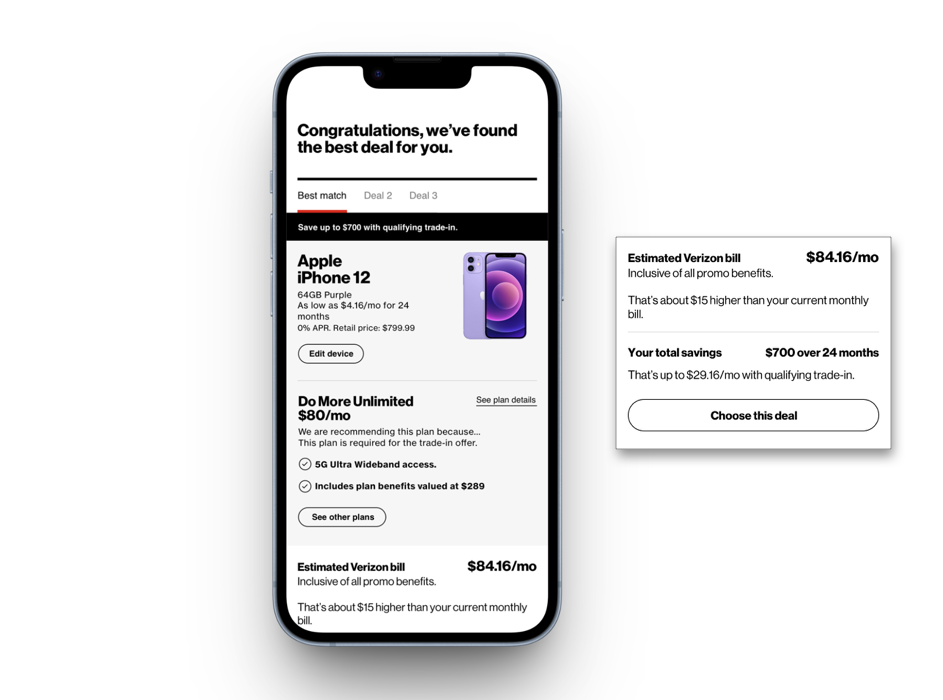
The first concept for the recommendation page combines a recommended phone, plan and promotion in an easily editable scrolling view. Based on the information collected in the questionnaire, the recommendation system selects the most relevant promotion for the user. This iteration highlighted the promotion in a black banner, giving most page real estate to information necessary to make the purchase decision. The customer can shop for another phone configure their device color and storage in a modal view. Total savings were highlighted as an incentive to complete purchase.
Customer Sentiment Test
We conducted user research to understand user sentiment around our promotion focused, recommendation-based experience in comparison to a traditional gridwall based shopping flow. Participants were wireless phone account owners who were open to switching carriers. Participants completed a purchase task with both flows.
The deviation from the expected shopping experience in the Concept design received mixed responses. Some felt the suggestion-based design removed some of the burden from them when researching phones and plans. The ability to see why a plan or phone was chosen and to make another choice was also viewed positively and gave transparency to the recommendations.
“I’m completely fine with someone choosing something for me. I do sometimes get overwhelmed if there are like 10 plans and I don’t know which one to go with.”
Task completion rate
The concept design required significantly fewer page views and clicks.
Concept Page views: 15.8 Existing flow Page Views : 25
Concept clicks: 20.7 Existing flow clicks: 35
Overall customer preference
Preference between proposed shopping experience and existing flow was almost evenly split. The BAU design was preferred because it gave users more options and was perceived to include more detail. The act of browsing and choosing a phone and plan were essential parts of the shopping experience for some.
“I do like the more streamlined concept, but it kind of feels like I wasn’t able to fully explore my options.”
General customer sentiment indicated that the recommendation-based experience had benefits for some customers, and could potentially reduce page views and overall click rate. This positive result validated our approach and led us to conduct usability testing on the larger experience.
Usability testing
The following round of user research would assess user comprehension of the experience. We also sought to understand what information users expected to see when they were presented with a recommended promotion.
Usability testing journey: Users completed the questionnaire, followed by recommendation page and cart.
Usability test outcomes
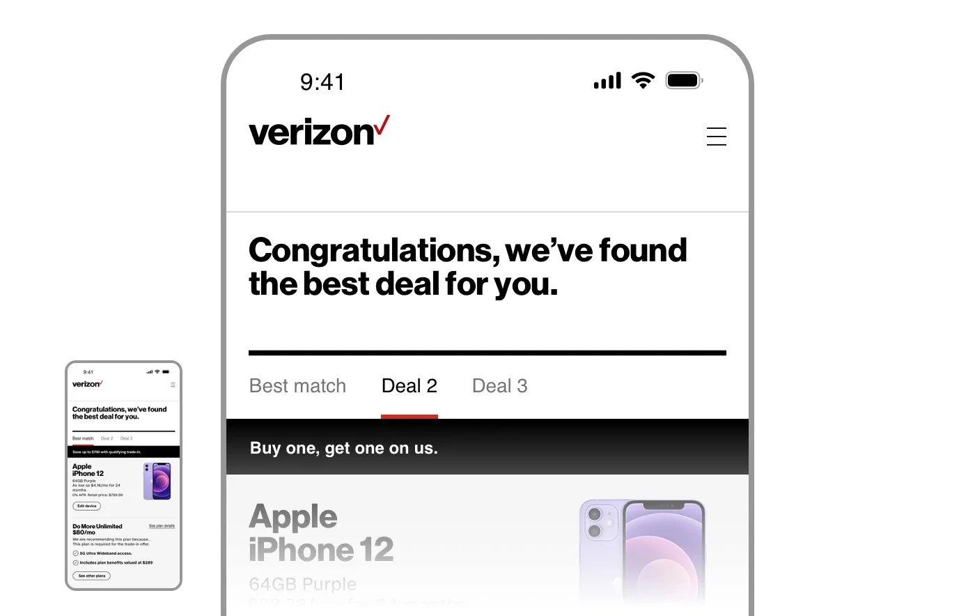
Recommendation page comprehension
The term ‘Deal’ used throughout the flow led users to expect phone and plan packages, but not ongoing Verizon promotions. Some users assumed each tab contained phone and plan packages categorized by price.
Pricing
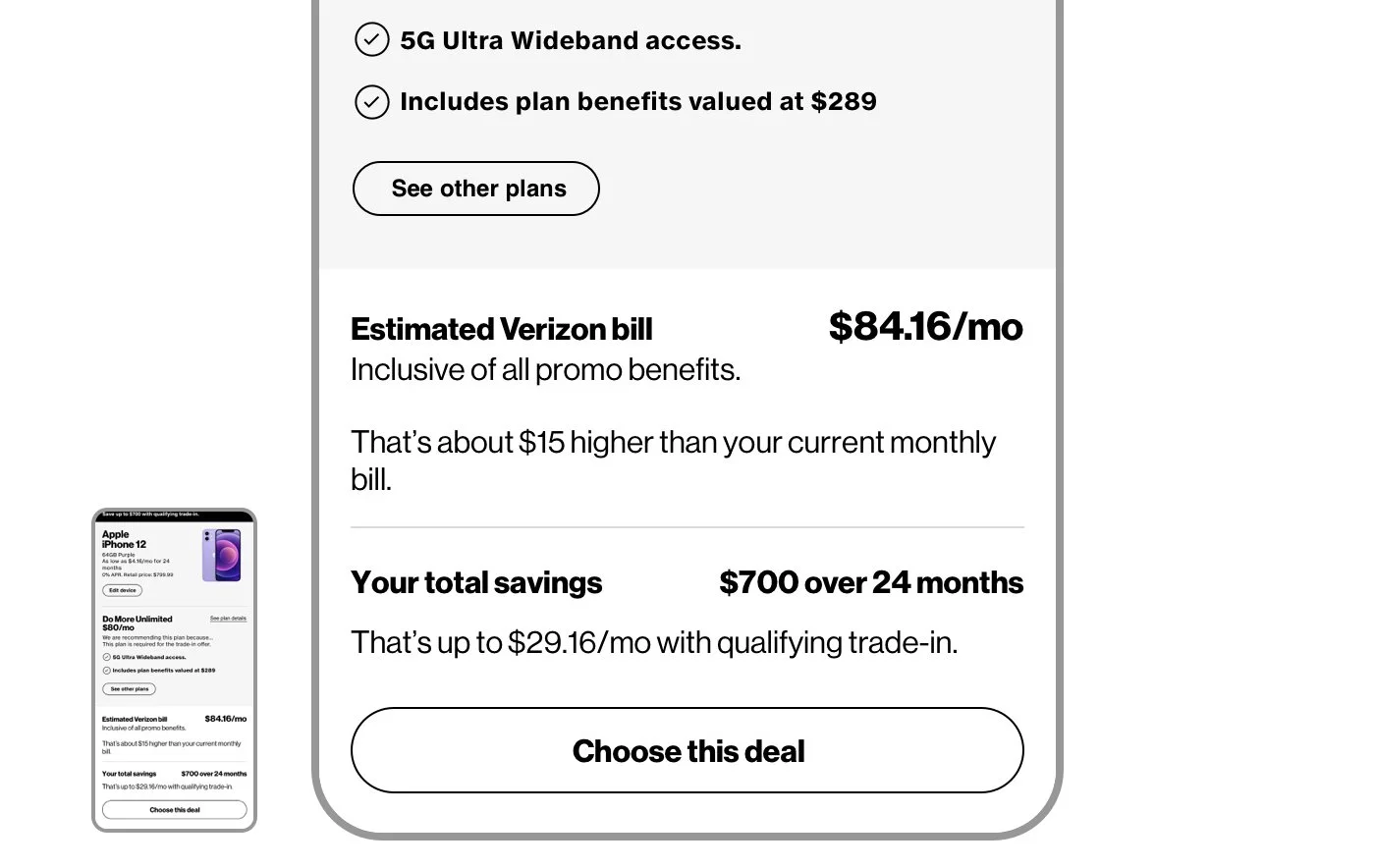
Customers struggled to understand pricing on the recommendation page. Many did not associate the total savings with the discount that appeared in the black banner or the reduced device price. Users wanted details about what would impact their final bill, including:
Final device and plan price (not an estimate)
The value or their trade-in and what might impact their trade-in value
Taxes, fees, shipping, etc.
“I need to know about up front costs. If I wanted to purchase, how much would I pay? Shipping and handling? Deposit?”
Refining the concept
After identifying key problem areas in the recommendation page design, we engaged a copywriter and subject matter experts to make improvements to the experience.
Left: Recommendation page concept from initial user testing, Right: New concept
Messaging improvements
Use of the word ‘deal’ was a source of confusion in users surveyed, so language was revised to reference ‘offers’ instead, aligning our usage with terminology used throughout other parts of the site. A subheader was added to provide context to the content appearing on the page below. The name of the offer was also elevated to the H1 type style.
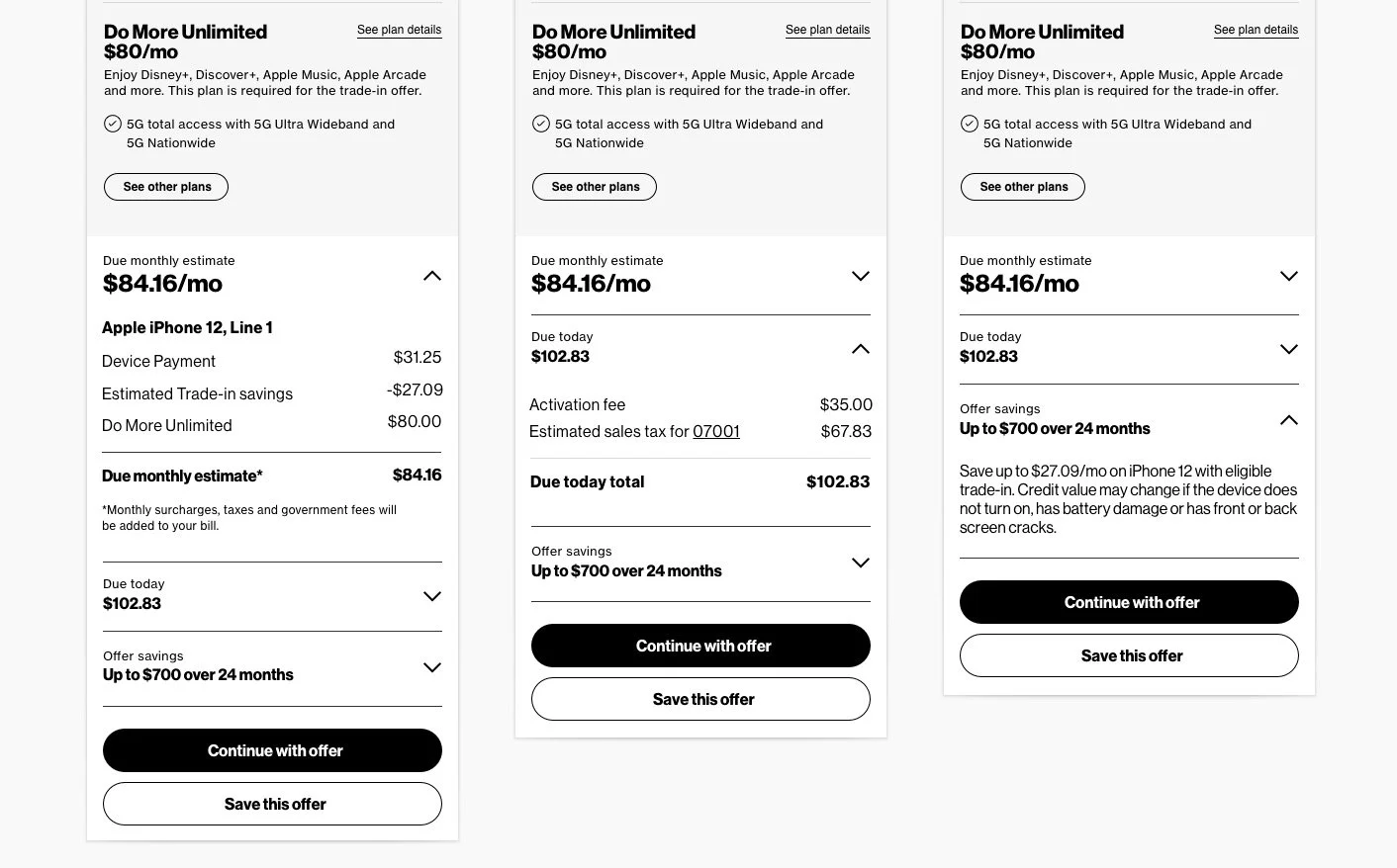
Left: Due monthly estimate expanded, Center: Due today expanded, Right: Offer savings expanded.
Pricing module
Resulting from the large amount of feedback on the lack of clarity around pricing, a more robust billing section was concepted with input from billing subject matter experts. Designed to incorporate the customer’s estimated monthly bill, as well as due today amount and offer savings, an interactive accordion would allow customers to view the details of their bill before committing to an offer. The offer savings section would include additional language about specific offer criteria and terms.
Project Outcomes
Leading design on this initiative to improve a key shopping flow for new customers meant close engagement with parthers around the organization. Customer feedback was integrated into decision making at every stage, from sentiment to usability testing, validating the thesis that a recommendation driven approach could offer a valuable alternative to the existing shopping flows. Planned A/B testing will reveal additional insights from a larger volume of customers and shape the direction of the experience.